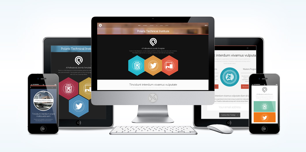
Polaris
A Premium Joomla Template
Polaris is a fully Responsive Joomla template, perfect for schools, educational sites, and universities. The template style is on the cutting edge of web trends with a focus on the current "Flat" design style and the use of CSS3 and Javascript effects.Enhanced with Bootstrap CSS, Polaris scales to pixel perfect widths to enhance viewing on Large Format Monitors, Tablets, Phones, and even the latest Retina devices!
The core Joomla template features (70+) module positions; (60+) module style variations, (4) preset styles, rich typography options, CSS3 progressive enhancements, Bootstrapped and Responsive Design and so much more.
The Quickstart package even comes with some of JoomlaXTC's most popular extensions—like Deluxe NewsPro Module, Contact Wall and our Html Pro Module.
Polaris was built with the JoomlaXTC Framework which offers deep customization options and gives you total control over your site's look & feel—from Width Adjustments, Region & Column Layout, Backgrounds, Font Colors / Sizes / Typeset, Module Layout and custom preset styles.
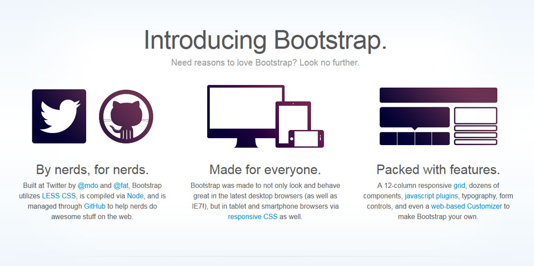
XTC Framework 2.0: Built on Bootstrap
Bootstrap is a Sleek, intuitive, and powerful front-end framework for faster and easier web development. We use a new responsive, fluid grid system to create seamless, responsive layouts. By using the core Bootstrap and custom break points, our responsive design is as dynamic as possible using only CSS3 media queries.
Bootstrap also provides styles for common HTML elements like typography, code, tables, forms, and buttons. It also includes Glyphicons, a great little icon set, as well as the Font Awesome icon set for even more font based icons.
The XTC Bootstrap grid utilizes 12 columns, allowing you to create a fluid AND responsive layout. With the responsive grid in, the layout will adapt to any screensize. The columns become fluid and stack vertically, and each column will adapt to the available size it should have ensuring proper proportions all devices.
Media queries allow for custom CSS based on a number of conditions—ratios, widths, display type, etc—but usually focuses around min-width and max-width.
- Modify the width of column in our grid
- Stack elements instead of float wherever necessary
- Resize headings and text to be more appropriate for devices
Use media queries responsibly and only as a start to your mobile audiences. For larger projects, do consider dedicated code bases and not layers of media queries.